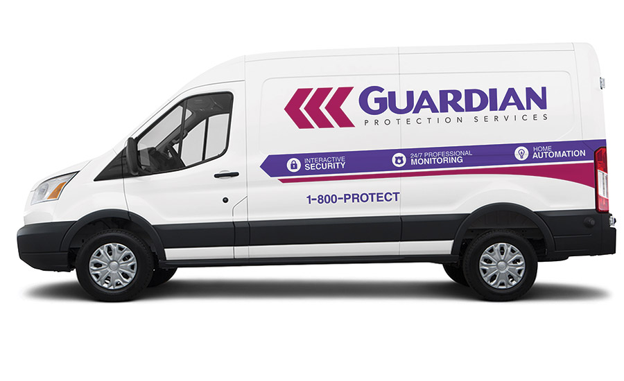
As its 65th birthday approaches, Guardian Protection Services, Warrendale, Pa., has refused to “act its age” and rest on its historic laurels. In 1950, Guardian Alarm Systems of Pittsburgh Inc., the former identity of Guardian Protection Services, was solely focused on the installation of security systems for jewelry stores. The name and the breadth of services offered both changed in 1975, when current CEO, Russell Cersosimo, bought the business and created Guardian Protection Services. Fast forward by 40 years, and the company was ready for another facelift, Cersosimo shared.
Rebranding is often a good way for a company or business to reintroduce itself to the market, but it has to be done right. “You don’t want to create bad change, obviously, nor do you want to make a change, just to say you made a change for change’s sake. What you want to do is make a real mark when you change your brand,” said Joe Lininger, vice president of marketing. He added, “We all asked ourselves, ‘Who are we?’ and ‘Where are we going as a company?’”
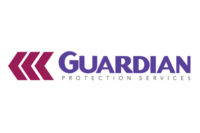
It didn’t take Guardian too long to know it was time for a change. The rebranding effort got its steam after the company created a strategic plan in late 2013. The plan itself was instrumental for instituting change. “It allowed company executives to figure out why a rebranding was needed in the first place,” shared Bob Haskins, vice president of strategic planning and business development. “We were able to retain legacy elements of the previous Guardian logo, leveraging our roots as we migrate into more new areas of product and service, and also evidenced by our new tag line: ‘The Heart of the Connected Home.’”
The image of a well-connected residence chock full of home automation services is a nod to the direction the industry is taking when it comes to smart homes. “It is no secret. Our industry is talking more about home automation than just security these days,” said Lininger. “We have the advantage of being a strong historic security company who can offer home automation technology — we want to be clear on what we have to offer our customers.”
Despite the new brand with its logo, letterhead, and even the way salespeople will approach customers to share Guardian’s place in the home automation world, for Guardian, the heart of the business remains the same, said Haskins. “Our mission is to deliver leading security solutions and exceptional customer service, even as the world and our industry change rapidly and dramatically; to continue our commitment to expand our security technology offerings to keep pace with an evolving marketplace; and to increase brand awareness as we develop an increasingly strong national presence,” he explained. “These objectives helped us to identify this moment in our history as the right time to modernize our look.”
When it was time to create the company’s new logo, Lininger and Haskins got to work researching successful brands. “We did a lot of research into historic brands and looked at a ton of different logos. After putting together a 30-page report, highlighting over 50 different companies, we soon realized that the most successful brands had small, nuanced changes in their logos, for the most part,” shared Lininger.
Behind every successful brand, of course, is a well-known logo — think of the Nike swoosh, the golden arches, an apple with a bite taken, or a yellow sea shell outlined in red. The internal design team went to work on creating a logo that would retain the legacy elements of the original design, but be different enough to have an impact, as reflected in many other rebranding efforts.
“One example is Shell Oil Company. While their logo has undergone 10 updates since 1900, the hallmark shell symbol is still a very present element,” said Haskins. “I believe Guardian has achieved a similar integrity with its new logo. The chevrons are still present but they are updated. The colors are very similar to our previous logo. But the look and feel are fresh and new, and speak to today’s changing world. Yet, when you put the new logo on a yard sign, it still says ‘Guardian.’’’
In addition to a fresh look, Guardian wants customers to understand that it has adapted to the ever-changing technology of the security industry. Guardian will also unveil a new website later in 2015, and a new mobile app.
“We achieved a rebranding of our mobile app that is a ‘face’ to today’s consumer,” said Haskins. “Realistically, we decided that if we were going to give ourselves a new look and feel, we needed to get it in front of our customers on a daily basis.”
Developed for both iOS and Android, the Guardian app features potential expandability as additional Guardian services and special messaging are made available to customers via a mobile platform. The app will be downloadable from the Apple iTunes store or Google Play store. “By branding our mobile app with a fresh Guardian logo we both empowered our brand and, I believe, reduced customer confusion in doing so. It is now more likely that our customers will say that they have ‘a Guardian system,’” said Haskins.
Lininger, who has been with Guardian for two years, and has experience in rebranding efforts, said the process for Guardian was a new experience for him. “This was very different than the rebranding of a start-up company,” Lininger said. “Guardian has a rich history. No one wanted to ignore it; we wanted to build on it.”
When a company has a long history, he said, it is crucial when rebranding for everyone to have a chance to express his or her opinion. “We shared our ideas with the stakeholders, keeping them in the loop, and the executive staff was involved in the decision making process. Everyone got a chance to be heard,” he said.
Of course, rebranding is an ongoing process and the company isn’t finished with it, per se. “The auditing of products that need to be changed, from business cards to window decals, and business cards and letterhead, is not to be underestimated,” shared Lininger. “And we will be communicating closely with our customers so that they understand how we can even better serve them now with the updated brand. We have the advantage of being a strong historic security company who can offer home automation technology — we want to be clear on what we have to offer our customers.”
Lininger advised that if owners are interested in rebranding like Guardian did, they should take note of a few important things: “Share your plans from the start with your stakeholders, and do not abandon your historic value — whether it is a mark itself, or your reputation, whatever your strength is as a company — never abandon it. And don’t forget about your customer.”
Guardian’s rebranding process was a positive one, agreed everyone interviewed for this story. President Joseph Colosimo told SDMthat the support and confidence of Guardian’s parent company, Armstrong, was one key to its success. “Armstrong was on-board with our purpose for the rebranding and even provided professional marketing input at various junctures, which was valuable to us.”
Of course with change can come hurdles, and the biggest one was the company itself, shared Colosimo. It was slightly hard to temper what he described as the “sentimental esteem” many held for the former logo. “Many of us could fondly recall the development and launch of the former logo during the eighties.”
When Cersosimo bought the firm, he hired what he described as a “fancy advertising firm” to help him brand his new company. When they failed to please the CEO, he happened upon a couple during a sales call. After explaining the situation to them, the woman, a stay-at-home mom with a marketing degree and experience in design, offered to help.
“She said if I liked the logo design, she would be happy receiving $500 in consideration for her work. I loved what she came up with and we were both happy with the transaction. At the time I was selling about 20 systems a month. Forty years later I happened to run into this couple at a fundraiser. We talked about how Guardian has grown. She jokingly commented that, now knowing there are more than a quarter million Guardian yard signs out there, she wishes she would have negotiated a one cent royalty per sign instead of a $500 fee.”
As Guardian positions its brand this spring, everyone interviewed appears excited about the direction the company is taking with the new brand. “Based on the low attrition rate we enjoy in this industry, it is my hope that in viewing our new logo, our customers will see us as the progressive technology company that we are, but also as a provider firmly committed to its history of delivering peace of mind through state-of-the-art product and customer service excellence,” Colosimo described


